If you’ve ever used Duolingo, you’ve probably noticed this section:
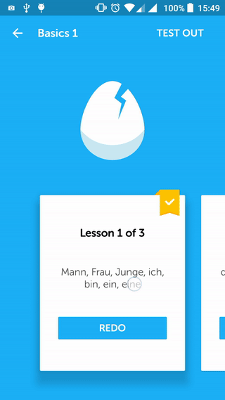
Looks pretty cool, right? I was interested in learning how the Duolingo team did this, so I started playing with a sample project to achieve the same result.
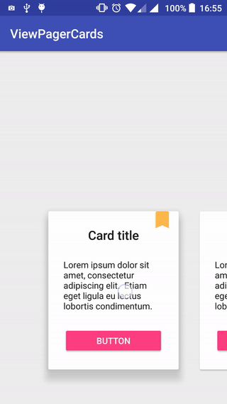
The main difference between this and a normal ViewPager behavior, is that you can see 3 items at the same time and 2 of them only partially.
The first thing I did was creating a simple layout that had a CardView:
After the adapter was done, I set up the ViewPager in an activity:
<android.support.design.widget.CoordinatorLayout
    xmlns:android="http://schemas.android.com/apk/res/android"
    android:layout_width="match_parent"
    android:layout_height="match_parent"
    android:fitsSystemWindows="true">

    <android.support.v4.view.ViewPager
        android:id="@+id/viewPager"
        android:layout_width="match_parent"
        android:layout_height="330dp"
        android:layout_gravity="bottom"
        android:clipToPadding="false"
        android:overScrollMode="never"
        android:paddingBottom="30dp"
        android:paddingEnd="@dimen/card_padding"
        android:paddingLeft="@dimen/card_padding"
        android:paddingRight="@dimen/card_padding"
        android:paddingStart="@dimen/card_padding" />

</android.support.design.widget.CoordinatorLayout>
The most important thing here is the attribute clipToPadding. When this is false, the ViewPager won’t cut off the views that we want to show partially and the current item will still be centered.
By changing card_padding, you’ll also be modifying the view width. In this sample, I used 60dp to get a result similar to Duolingo.
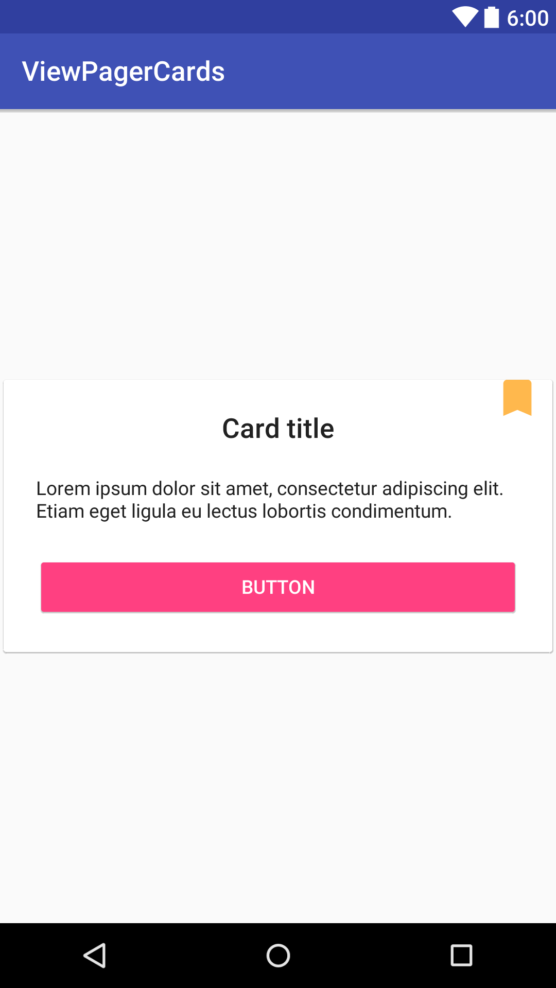
With this setup, we should have already 3 items visible, 1 one of them centered and 2 of them partially visible. Now we just need to animate the elevation of the cards.
Shadow animation
To do this, I created a ShadowTransformer that implements OnPageChangeListener and PageTransformer listeners. When the user scrolls to the next card, it should get higher and the previous card should get lower.
This is done by using the method setCardElevation of the CardView with an appropriate factor that depends on the scroll offset. In this sample, the CardView base elevation is the default (2dp) and the card will elevate up to 16dp.
The end result:
This sample is available on my Github: https://github.com/rubensousa/ViewPagerCards/